
Make up of type
To understand the typeface technical terms used in software we can look back at the construction of the original letterpress blocks.

X height is the lower case 'x' height, The anatomy of type is summarised by Ellen Lupton in the image below

Height
The point system is used to measure type.
One point = 0.35 mm
12 points = 1 Pica
A Pica is the unit commonly used to measure column widths.
Typography can be measured in inches, millimetres or pixels and most software accommodates the users unit of choice; although pica's and points are standards.
A typeface is measured from the top of the capital letter to the bottom of the lowest descender, plus a small amount of buffer space.
Abbreviations
8 picas - 8p
8 points = p8 or 8 pts
8 picas, 4 points = 8p4
8 point Helvetica with 9 points of line spacing = 8/9 Helvetica
if no space or leading = 10 pt solid
The leading or line spacing was derived when the original letterpress fonts were spaced out using a piece of lead.
Width
A letter also has an horizontal measurement called its set width. Although you can change the set width of a typeface by altering the horizontal or vertical height it is recommended to chose the condensed, compressed, wide or extended version of the type you are looking for.
The x height, line weight and set width all contribute to the apparent size of different fonts. So fonts with the same point size can appear different sizes.
Kerning
Is the space between any pair of letters
Tracking
Space between all the letters
The Grid
Anatomy of a page

Grid elements
Exist to position Type - needs to be readable
And image
Columns - number of columns and width
Baseline - a series of imaginary parallel lines used to guide the placement of text
Set solid - set text same leading as type sizes
In the workshop in groups we chose a newspaper and tried to work out what size grid the newspaper uses. We had to measure and mark out the grid on the page. We had The Guardian which we discovered had a 20 column grid which enables the editor to layout very complex and varied layouts.It took us a while to work this one out!
I later found an article on the Design Museum Website which explains the main grid is actually five columns however underlying this are 10 and 20 column grids.


The work supporting this workshop is in the A2 folder. This includes using a Pica ruler by measuring different typefaces, leading and establishing line spacing. We also experimented with a magazine layout by redesigning several thumbnails before coming up with a final design.
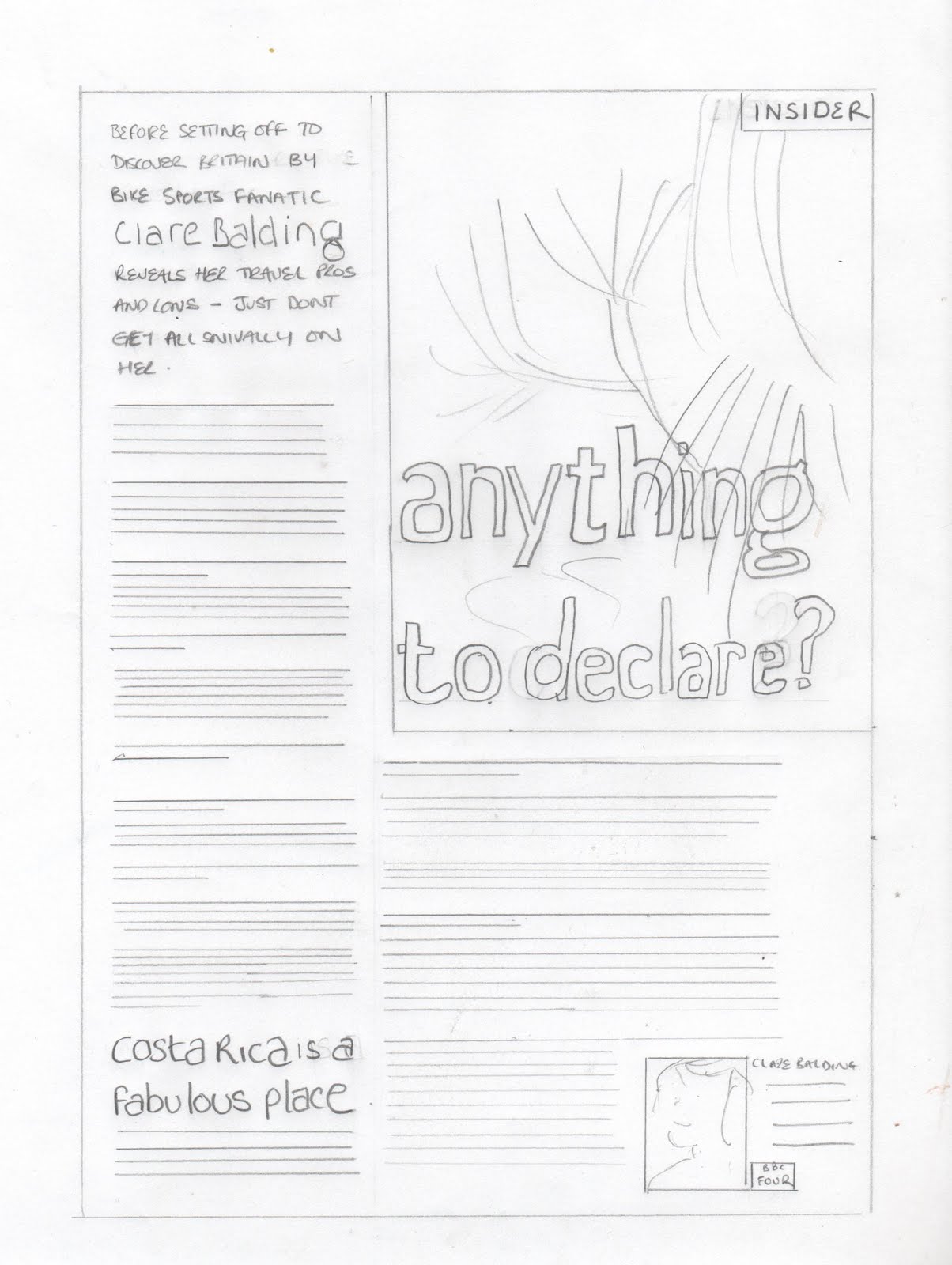
This is the magazine layout I chose and also the final design I came up with.

A PICA ruler


No comments:
Post a Comment