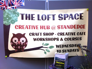
A free banner Janet got made at Vista Print
Some Promo material for Green fusions
An advert in The Huddersfield Eye
Their initial idea for a logo (an image of Tunnel End)
My first thoughts on reading the literature about The Creative Hub/Loft Space/Green Fusions as there were several identities and was quite confused by what it actually was.
At the first meeting Janet explained that The Canal & River Trust who owned Standedge Visitors Centre had just been reorganised as a trusts and she was not sure how long The Loft Space would be based there.
In the meantime we agreed:
- I would design the logo for The Loft Space for the end of August
- I would also look at Green Fusions website and giver her some ideas for redesigning the site
We discussed design direction
Not just textiles, although Craft wanted to get acros 'professionalism' and experience not just 'crafty',
Green/Eco
Hand made
Tuition
Liked the Owl symbol/wisdom
Words that came immediately to mind:
Community, friendly, Craft, natural, green, countryside, warmth, welcoming, space.
Open publication - Free publishing - More creative hubs
These are the initial logo ideas I came up with. I was trying to recreate the feel of the tunnel end idea in some. On others I experimented with Traditional Crochet Pattern style fonts.
These are the initial logo ideas I came up with. I was trying to recreate the feel of the tunnel end idea in some. On others I experimented with Traditional Crochet Pattern style fonts.


No comments:
Post a Comment